
Responsive web design is now required for all organizations. A website that looks amazing and operates effectively on mobile devices can help potential and current consumers remember your company. Rocket Web Development can assist you with developing a responsive website that looks great on any device! Get in touch with us now to get started!
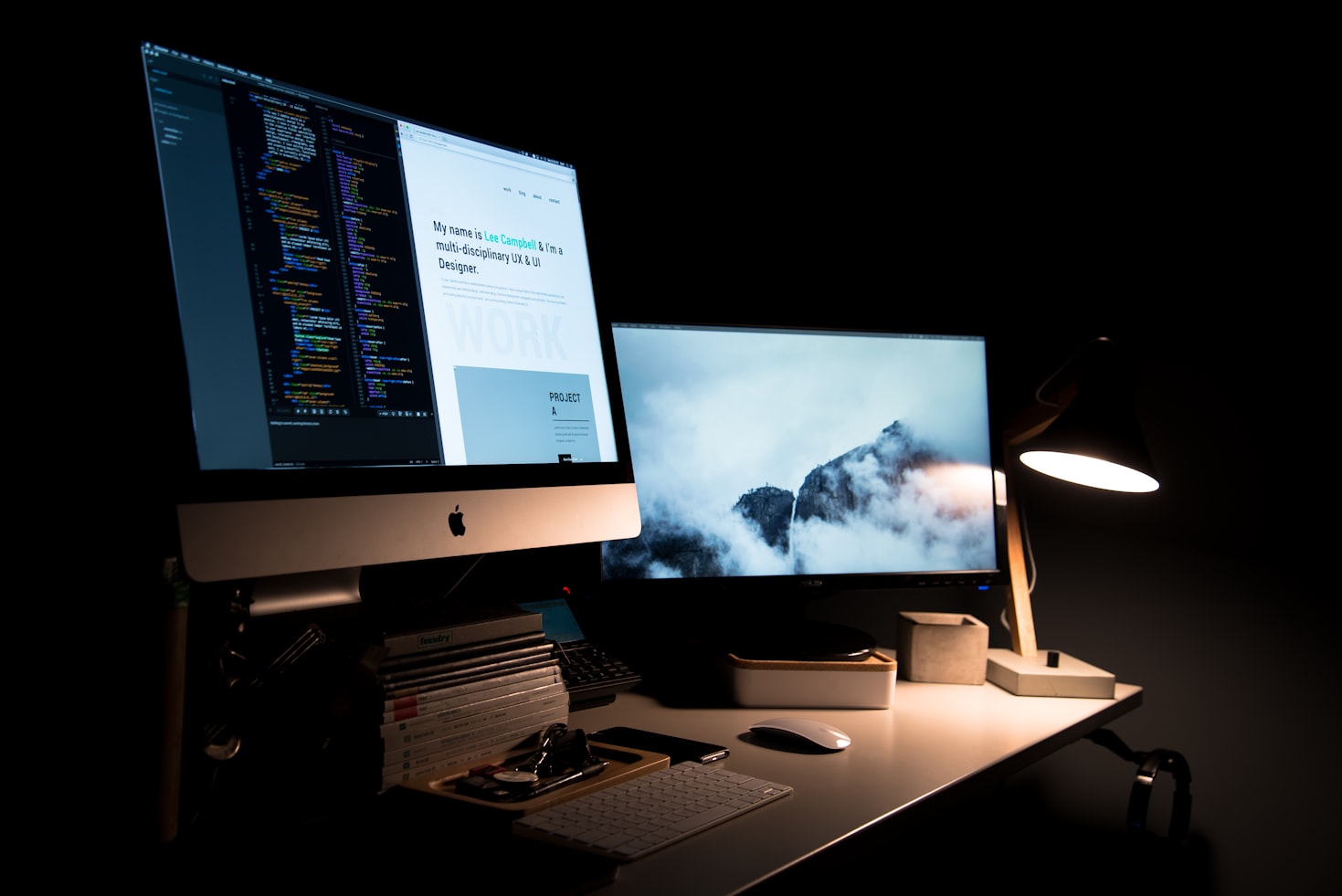
In the past, creating a website that looked good on multiple devices was a challenge. You had to create layout elements for different screen sizes, and then hope that your visitors would have the same device as you tested on. If they didn’t, they would see a website that was either too large or too small, with text that was either cut off or stretched out.
Thankfully, those days are behind us! With responsive web design (RWD), your website will automatically adapt to the device that is being used to view it. No more multiple media queries – just one website that looks great on any device!
If you’re like most company owners, you’re constantly seeking new methods to reach out to additional clients. In today’s environment, this involves making sure your website is mobile-friendly.
A responsive website adapts its layout to the device being used to view it, whether it’s a desktop computer, a laptop, a tablet, or a smartphone. As more people use mobile devices to access the internet, this is an essential trend to watch.
The capacity of a website to automatically alter its appearance and content to match the device on which it is being viewed is referred to as responsive web design. Whether it’s a desktop computer, a laptop, a tablet, or a smartphone.
This may be accomplished in one of two ways: by including responsive design code into the site or by utilizing media queries to deliver various versions of the same page to different device classes.
As more people use the web from their mobile phones and tablets, responsive design has become increasingly vital. More than half of all internet traffic now originates from mobile devices, so if your website isn’t adaptable, you’re losing a lot of prospective clients. We specialize in responsive site design at Rocket Web Development.
The process of developing a website

The process of developing a website that adapts to the device capabilities on which it is being viewed is known as responsive web design. This implies that visitors to your website will have an excellent experience whether they are using a desktop computer, a laptop, or a mobile phone.
Because mobile devices are growing more prevalent, it is critical that your website be mobile-friendly.
Responsive web design may be accomplished in a variety of ways. “Media queries” are a common strategy. You may target certain devices with media queries and alter the appearance of your website accordingly. For example, if you want to ensure that a specific item is displayed exclusively on mobile phones, you may use media queries to do this.
The use of “fluid grids” is another prevalent strategy for responsive web design. A fluid grid determines the size and arrangement of components on a web page using percentages rather than fixed numbers. This guarantees that your website looks excellent regardless of the device being used to see it.
Because more and more people are accessing the internet via mobile devices, responsive site design is essential. You’re losing a lot of potential business if your website isn’t responsive. Fortunately, with the correct tools and approaches, responsive web design is simple to produce. So don’t put it off any longer; start designing responsive websites right away!
Rocket Web Development offers you all of the tools and information you need to get started with responsive web design. Get in touch with us today to learn more!
Website optimization for mobile devices

It is no longer a luxury, but rather a need if you want to give your consumers a decent web experience. With mobile traffic now accounting for more than half of all internet traffic, it’s critical that your website be mobile-friendly.
Responsive web design is an important part of mobile device optimization. Fluid grids and flexible pictures that adapt automatically to match the screen size of the device on which they are viewed are used in responsive web design. This enables you to design a single site that looks great on any platform, from desktop PCs to smartphones and tablets.
Another benefit of adaptable web design is that it may assist minimize bandwidth use and loading times. When a visitor views a website on a mobile device, the server gives them the mobile version, which is often significantly smaller than the desktop version.
Responsive web design enables you to deliver the mobile version to mobile devices without the requirement for a separate mobile website.
Responsive web design is a method of making online pages adapt to multiple screen resolution sizes. This is accomplished by utilizing CSS styles to alter the layout of the website according to the screen size. Responsive design is becoming increasingly popular because it provides customers with a better experience across desktop smaller screens, tablets, and smartphones.
Rocket Web Development specializes in responsive website design. We can design a website that looks fantastic on every device, regardless of screen size. Our team of specialists will collaborate with you to develop a website that looks amazing and works flawlessly on all devices.
Contact us immediately if you want a modern responsive design that looks great and works effectively on all devices. We’d be delighted to assist you in obtaining the website you want and deserve.
Browser window size and font sizes
One typical issue with mobile-friendly websites is that text might be too tiny to see on some displays. This can easily be remedied by raising the font sizes in your style files. Adjusting the width of the browser window size is another approach to optimize your website for mobile devices. You might wish to select a minimum width so that the layout doesn’t get overly crowded on smaller displays.
These are just a few pointers for making your website mobile-friendly. Please contact Rocket Web Development for further details. We can assist you in developing a mobile-friendly website that gives a positive user experience for your visitors.
One of RWD’s important benefits is its ability to adjust text size based on the device’s display size. This means that no matter how you see the site—close up or from across the room—the content will always be legible.
Furthermore, when browser window widths vary, so does the layout of the website in order to make the greatest use of the available space. Responsive images and other multimedia assets are also automatically optimized for mobile devices, ensuring that they appear fantastic regardless of screen size.
RWD is a vital component in the design and development of any website. You will be able to reach a larger audience and enhance the overall user experience if you ensure that your site looks fantastic and performs smoothly on all devices. Contact Rocket Web Development now to find out more about RWD and how we can assist you in creating a responsive website that surpasses your expectations!
Design for Responsiveness

It is a web design strategy that creates fluid layouts by combining font size, media queries, and CSS media queries. Responsive Design is best suited to devices with varying screen sizes, such as smartphones, tablets, and desktop PCs.
Responsive Design is a technique that may be used to develop websites that look fantastic on any device. You don’t need to design several websites for different devices; Responsive Design allows you to create a website that looks fantastic on any device.
Size of the font
The media query determines the font size. On smaller devices, the font size will be lower, while on larger ones, it will be larger. This ensures that the typeface is always legible, regardless of the device.
Inquiry into the media
A media query is a CSS rule that applies to a certain device or media type. A media query may be used to target a variety of devices, including smartphones, tablets, and desktop PCs.
CSS media queries
CSS media queries are used to manage the appearance of a website’s layout. CSS media queries enable you to design layouts that are specific to each device. For example, a tablet layout may be used for tablets, while a smartphone layout can be used for smartphones.
A responsive design is a web page layout that adjusts to the size of the screen on which it is being viewed. The font size will be adjusted, photos will be resized, and information will be rearranged to ensure that everything appears excellent no matter what device you’re using.
CSS media queries are used to target certain devices with specified rules. You may, for example, specify a maximum width for desktops and laptops but adjust the text size for phones and tablets. This guarantees that your site appears amazing whether viewed on an iPhone or a huge monitor.
Rocket Web Development is an excellent choice if you’re searching for an internet marketing business that understands responsive design inside and out! We’ve spent years designing attractive, responsive websites that look fantastic on any device. Get in touch with us today to learn more!
What exactly is responsive design?

The notion of responsive design proposes that design and development should adjust to the user’s surroundings and screen size. When designing a responsive website, the font size, media query, and screen size should all be taken into account. As a result, your website will appear excellent regardless of the device it is visited on.
What is the significance of responsive design?
With so many various screen sizes and devices available, it’s critical to have a website that looks excellent on them all. You can ensure that your website looks great no matter what device it is viewed on by employing responsive design. This is essential for any company that wants to reach as many clients as possible.
How can I make a website that is mobile-friendly?
There are several methods for developing a responsive website. You may use a responsive template or media queries to adjust the size and layout of your pages depending on the screen size of the device that is seeing them. If you’re feeling daring, you may also develop completely unique designs that adapt to different screen sizes.
Whatever strategy you use, make it important to test your website on a range of devices to ensure that it appears well everywhere. To examine how your website looks on different screen sizes, utilize Google’s free testing tool.
Responsive design is increasingly becoming the industry standard for website construction, so stay ahead of the curve by developing a responsive website for your company today. Rocket Web Development can assist you with getting started!
Responsive design vs. adaptable design vs. mobile-first design

When it comes to screen size, there are three approaches to web design: responsive, adaptable, and mobile-first. Each has advantages and disadvantages. Let’s take a look at each one individually.
The width of the screen is used in responsive web design. The page’s layout changes based on the width of the screen. This is often accomplished through the use of media queries, which are essentially rules that state, “If the screen width is this or less, do this; if it is greater than this, do that.” Responsive websites often begin with a desktop-style and then expand to include capabilities for smaller displays.
This might be troublesome since you may not always want or desire all of the functionality available on a smaller screen. On a phone, for example, you may not need the menu bar or sidebar, but they are still present and taking up space.
The viewport width is used in adaptive web design.
The page’s layout varies based on how much screen space is available. This may be accomplished using either media queries or JavaScript. Adaptive websites often feature two layouts: one for desktop and one for mobile devices.
This can be troublesome since creating various layouts can be time-consuming, and you may not always obtain the intended results. For example, if you have a layout created for 320px wide displays and someone views it on a device with a screen width twice that size, the layout will be too tiny.
The screen size and viewport width are used in mobile-first site design. Like adaptable web design, the layout of the website varies based on how much screen real estate is available. Mobile-first websites, on the other hand, only have one layout – for mobile devices. This might be a concern since it may not look or work properly on desktop devices.
For example, if you have a phone-optimized website and someone reads it on a desktop computer, they may notice a lot of empty space since the page is too broad for the screen.
So, which strategy is the most effective? That is determined by your requirements and preferences. Responsive web design is the way to go if you want a website that looks excellent and operates well on all screen sizes.
If you don’t mind designing numerous layouts and want more control over how your website appears on various devices, adaptable web design is the way to go. And if you’re solely interested in mobile devices, mobile-first web design is the way to go.
Whatever technique you use, Rocket Web Development can assist you in creating a beautiful and effective website that fulfills your goals. Contact us today for a no-obligation consultation!
Responsive web design technical components

These are photos with fluid grids. The layout of a web page adapts to the width of the device, whether it be a desktop computer, laptop, tablet, or phone. The idea is to have a single web page that looks good and works properly on any device.
Flexible images must also be responsive so that they do not become distorted when viewed on different devices. Typically, this entails setting the image’s max-width attribute to 100%. The srcset element may also be used to supply different pictures for different devices.
The use of media queries is another crucial part of responsive web design. You may target various devices or breakpoints and apply different styles based on those variables using media queries. For example, you might construct a media query that just targets mobile browser devices and increases the text size for easy reading.
There are several responsive web design frameworks available to assist you in getting started. Bootstrap, Foundation, and Skeleton are a few examples. These frameworks contain established grid systems, styles, and scripts that make creating responsive websites simple.
Font size is another factor to consider.
You might wish to select a responsive typeface that adjusts to the width of the screen resolutions. Google provides a nice collection of free typefaces that you may use.
You must test your web page on various devices and browsers. There are several online solutions for this, like BrowserStack and Responsinator.
That’s all there is to it! The goal of responsive web design is to create websites that look amazing and work properly on any device. It’s an excellent option for companies who want to reach as many clients as possible with a single website.
If you want to learn more about responsive web design, Rocket Web Development has a number of courses available. We also provide economical web design services to assist you in getting your website up and operating. Get in touch with us today to learn more!
Creating a responsive web page might be difficult, but the enhanced user experience is well worth the effort. Rocket Web Development can assist you in developing a responsive web page that looks fantastic and works effectively on any device. For further information, please contact us right away!
What are the three elements of a responsive web design?

The flexible grid is one of the most significant features of responsive web design. This allows your website to adjust to multiple device widths, regardless of how huge or tiny the screen is.
Second, you’ll need pictures that are responsive. With an increasing amount of people accessing websites on mobile devices, it’s critical that all of your photos be properly scaled and look amazing no matter what device they’re viewed on.
Finally, you can use media queries to target certain devices and modify your design accordingly. Your website will appear great on every device, whether a desktop computer, tablet or phone!
As the number of mobile devices grows, responsive web design is becoming increasingly vital. A responsive website’s layout automatically changes to match the max-width property of the device, whether it’s a phone, tablet, or desktop computer. This guarantees that your visitors receive the best possible experience regardless of the device they are using.
Responsive design relies heavily on flexible grids. They enable you to design layouts that adapt to various screen sizes and orientations. Other essential elements to consider when developing a responsive website include device width and browser width. You can develop a website that looks excellent on every device if you grasp these fundamentals.
Give Rocket Web Development a call now if you want to ensure that your website is responsive and looks fantastic on any device! We’re responsive web design professionals that can help you develop a website that looks great no matter what device it’s viewed on. Call us right away for a free consultation!
Advantages of Responsive Web Design
There are several advantages to using responsive web design, including:
Improved user experience across several devices.
A better user experience on various devices is one of the primary benefits of responsive web design. Desktop users, for example, might have a widescreen view, whilst mobile users can have a more condensed view that nevertheless displays all important information. This is accomplished through the use of a CSS grid layout, which instructs the browser on how to display the website dependent on the screen width.
Development time and costs were cut.
That is what you can anticipate if you choose a responsive web design. You won’t have to bother about creating separate web pages for different devices since your website will adapt to the screen size of the device being used.
Maintenance and updates are simplified.
A PC screen is 960px wide, a mobile phone screen is 320px wide, and a tablet screen is 768px wide. You want to build your site such that it appears good on any device. A CSS grid layout is used in responsive web design to alter the size of everything on the website based on the width of the browser window.
This means that you simply need to design and develop your website once, and it will appear beautiful on any device. Browser instructions are delivered to the device, instructing it on how to alter the layout of the page.
Page visibility has increased in search engine results (SERPs).
That’s what you’ll get if you make your website responsive. Responsive web design is essential these days, and with Rocket Web Development’s assistance, it’s easier than ever to get your business up and running with a mobile-friendly site.
Web design is always changing and evolving in order to keep up with the newest trends and technology. Responsive web design has been one of the most significant advances in online design in recent years.
Responsive web design (RWD) is a strategy that allows your website to adjust to the screen size of the device being used to see it. This means that whether you’re reading a website on a desktop computer, laptop, tablet, or phone, the page will resize to match the screen size of whatever device you’re using.
There are several advantages to implementing responsive web design for your website. First and foremost, RWD ensures that all consumers, regardless of device, have an excellent experience while viewing your website.
With so many various screen sizes available, it’s critical to have a website that looks and works well on all of them. Responsive web design also aids in the optimization of your website’s search engine ranking. Because Google now considers mobile-friendliness as a ranking criterion, having responsive web content is more vital than ever if you want to rank high in search results.
If you’re unsure whether your website is responsive, there are various online tools that may help you test it. The most widely used tool for checking responsiveness is known as the “Responsive Design Checker,” and it may be found at. Simply enter your website’s URL into the tool, and it will tell you whether or not it is responsive.
Don’t worry if your website isn’t responsive; Rocket Web Development can assist you with making the required modifications to guarantee that your site appears excellent on all devices. Contact us today for a no-obligation consultation!
What are some examples of responsive web design?

The viewport meta tag is a popular example. By specifying a viewport width, you may modify how a website performs on different devices. Media queries may also be used to generate multi-device layout patterns. You may, for example, have one layout for desktop screens and another for mobile devices. Finally, the @media rule may be used to target certain devices or screen sizes.
Using multi-device layout patterns is another method for building responsive layouts. You may use these patterns to indicate how various elements of your website should be presented on different devices. For example, you could wish to display a sidebar menu on larger displays but conceal it on smaller devices.
You can ensure that your website appears amazing no matter what device it is viewed on by employing responsive design approaches. Rocket Web Development is here to assist you if you need an experienced team of specialists to help you design responsive web devices. We have years of expertise designing stunning and functional flexible websites. Contact us today for a no-obligation consultation!
How can I make my website mobile-friendly?
There are three basic methods for making your website responsive: CSS, JavaScript, or a mix of the two. You may use media queries in CSS to change the layout of your sites based on device widths and other variables like orientation and resolution.
To develop responsive layouts, you can also utilize flexbox or grid. You may use JavaScript tools such as Respond.js or Modernizr to identify browser capabilities and then adapt your code accordingly. You may also use feature detection to identify whether features are supported before loading alternative styles or scripts as needed. You can use CSS and JavaScript together, or any other way you like.
The easiest method to determine which technique is best for your website is to test it on various devices and browsers. Emulators such as BrowserStack may be used to test your sites on desktop browsers, mobile browsers, and tablets.
You may also examine your page at multiple widths by using the Responsive Design View feature in Chrome Developer Tools. Once you’ve settled on a strategy, make sure to properly test it on all devices and browsers that your users are likely to use.
Rocket Web Development provides responsive web design services to ensure that your website looks excellent on any device. We can assist you in selecting the best method and testing it across all devices and browsers that your users are likely to use.
Services for responsive web design
In this day and age, they are important. With desktop screen widths increasing, it’s critical that your website looks great on all devices. Rocket Web Development provides responsive design services to ensure that your website looks excellent regardless of the device used to view it.
Our responsive designs will ensure that your website appears great on any device, from small smartphones to giant desktop displays. A responsive page not only looks better but also gives a better user experience overall. The navigation is simple, and the material is legible regardless of the device’s size.
Device rendering may be a complicated affair, so leave it to the professionals at Rocket Web Development. We’ll collaborate with you to build a design that looks amazing on all devices and ensure that your website is totally responsive. So, what are you holding out for? Get in touch with us today to find out more about our responsive web design services!
Rocket Web Development, a responsive web design firm, provides desktop screen width size suggestions to assist business owners to construct beautiful and productive websites. For customers wishing to improve the appearance and feel of their website, the firm also offers CSS media query style recommendations.
Bottom line
Responsive web design (RWD) has been a hot issue in the world of web development since the arrival of Apple’s iPhone in 2007. In case you’re unfamiliar, RWD is a strategy that allows your website’s layout to adjust to any device—desktop computer, laptop, tablet, or phone. This is performed by utilizing CSS media queries to modify the layout and font size according to the screen dimensions of the device.
There are a few desktop screen width measurement suggestions to bear in mind if you’re creating a responsive page. To begin, it is critical to design your website with desktop displays in mind. This indicates that your site’s design should be built on a 960-pixel-wide desktop screen. The layout and font size may then be adjusted for smaller devices using CSS media queries.
Another consideration is the usage of pictures and videos. Make certain that these files are optimized so that they load fast on mobile devices. You may need to adjust or crop them as well. Finally, ensure that all of your connections are functional and take people where they need to go.
Rocket Web Development can assist you with CSS style advice. Web design, development, and marketing are just a few of the services available to improve the appearance and feel of your website. Get in touch with us today to learn more!
FAQs
What is a responsive web design and why do I need it?
A responsive design adapts to multiple screen sizes and multiple devices. This makes it so that the user can view your website on a desktop computer, laptop, tablet, or smartphone without having to scroll sideways (horizontally) or zoom in/ out of the page. Responsive web design is a modern approach to building websites that address the ever-growing number of devices and screen sizes on the market today.
All businesses should consider a responsive web design, but it is especially important for small businesses that want to make their website accessible from any device. A responsive web design can be implemented in multiple ways: through media queries, multiple style sheets, or a combination of both. Most modern browsers utilize a multiple style sheet.
Why should you care about a multiple style sheet?
When you create a website, you want it to look good on as many devices as possible. You don’t want people to have to scroll left and right or zoom in and out just to read your content. That’s why responsive web design is so important. It ensures that your website will look great no matter what device it’s viewed on.
How does responsive design adapt to changes in screen size?
A responsive web design will change the look of your website based on the size of the screen it is being viewed on. The layout will be adjusted so that everything is easily viewable and fits within the screen. This can be done with multiple style sheets, which are basically different versions of your website’s code that are designed for different screen sizes.
What are the min-width property and media queries?
The min-width property sets the minimum width of a container, while media queries allow you to create different styles for different screen sizes. This is what makes responsive web design possible – by using min-width and media queries, you can ensure that your website looks great on all devices, regardless of their size.
One important thing to keep in mind is that min-width only works if the width of the container is greater than the specified value. For example, if you set the min-width to 500px, and the container’s width is only 480px, then it will not be responsive.
What are responsive images?
Responsive image is a term used to describe image sizes that are appropriate for the resolution of the device they’re being displayed on. The image size (in browser pixels) will match or be proportional to the screen size, or parent element’s width. To create responsive images, you’ll need srcset and sizes attributes in your image tag.
The srcset attribute specifies image sources for a particular image. This could be an image at different resolutions, or it could be images that are meant to be displayed on different devices. The sizes attribute defines the layout width of the image in relation to its container.
Another way to make your website responsive is by using min-width and image size. This will change the amount of space available for content depending on the screen size so that multiple columns become one column when there isn’t enough room for more than one.
What is designing for multiple devices?
It is the creation of a site that responds to the device it is being viewed on. The layout, images, and text will change so that they can be easily read and used on different gadgets. There are three main aspects to consider when making a responsive website: grid-based design, flexible images, and media queries.
The grid-based design is a layout that is based on columns and rows. This makes it easy to resize the content when needed. Flexible images are used so that the image will not be cropped or stretched when it is resized. Media queries allow you to set different styles for different devices.
Responsive web design is important because more and more people are using mobile devices to search the web. It is important that your website can be easily viewed on these devices so you don’t lose customers.


